# Return to Monkey Island fan art
**URL:** https://forums.thimbleweedpark.com/t/return-to-monkey-island-fan-art/5021
**Category:** Fan Art
**Created:** [April 17, 2022, 10:47am UTC](https://forums.thimbleweedpark.com/t/return-to-monkey-island-fan-art/5021 "2022-04-17T10:47:54Z")
**Posts on this page:** 20
**Page:** 6
### Author:  [@LowLevel](https://forums.thimbleweedpark.com/u/LowLevel)
#### Post date: [August 8, 2022, 11:54am UTC](https://forums.thimbleweedpark.com/t/return-to-monkey-island-fan-art/5021/101 "2022-08-08T11:54:25Z")
I think that Ema was talking about the resolution, not the actual pixels.
Regardless of how much the picture was enlarged to appreciate its details on modern screens, the image actually has 320 picture elements for each line:

The rows are less that 200, though.
---
### Author:  [@BaronGrackle](https://forums.thimbleweedpark.com/u/BaronGrackle)
#### Post date: [August 8, 2022, 12:54pm UTC](https://forums.thimbleweedpark.com/t/return-to-monkey-island-fan-art/5021/102 "2022-08-08T12:54:19Z")
Maybe an art or psychology person can explain this to me, in regards to this fanart.
My brain tells me that, if we zoomed in on Guybrush’s face here (e.g. opening the parrot cage), then we might see a semi-realistic painting of Guybrush’s face, though perhaps slightly different than the one we saw in Secret. My brain tells me that the picture above is shorthand, and that there are a lot more details it isn’t displaying.
With the actual character sprites in Return, my brain is telling me the picture is NOT shorthand. My brain tells me all the details are as I see them, and a close-up version would show me the exact same thing.
Is it the pixelation? Is it the nature of Guybrush’s face? Is my style radar off, and no sane person would see this art as a shorthand that hides more details?
EDIT: But also: not the Lookout. My brain doesn’t see the Lookout as a shorthand, like this Guybrush. I think that’s due to his pointed nose.
---
### Author:  [@Ema](https://forums.thimbleweedpark.com/u/Ema)
#### Post date: [August 8, 2022, 3:17pm UTC](https://forums.thimbleweedpark.com/t/return-to-monkey-island-fan-art/5021/103 "2022-08-08T15:17:26Z")
> [@LowLevel](#):
>
> I think that Ema was talking about the resolution, not the actual pixels
Exactly. Or, to put it in other words, I meant the resolution of the image, and not the resolution of the file.
The footnote states 320x200, indeed.
> [@LowLevel](#):
>
> the image actually has 320 picture elements for each line
How did you manage to count them?
---
### Author:  [@LowLevel](https://forums.thimbleweedpark.com/u/LowLevel)
#### Post date: [August 8, 2022, 3:29pm UTC](https://forums.thimbleweedpark.com/t/return-to-monkey-island-fan-art/5021/104 "2022-08-08T15:29:42Z")
> [@Ema](#):
>
> How did you manage to count them?
1280 is four times 320, so I just switched on the grid on Gimp to see if each virtual pixel was composed by 4x4 real pixels:

---
### Author:  [@Ema](https://forums.thimbleweedpark.com/u/Ema)
#### Post date: [August 8, 2022, 7:47pm UTC](https://forums.thimbleweedpark.com/t/return-to-monkey-island-fan-art/5021/105 "2022-08-08T19:47:25Z")
Fireflies or… Evil eyes?

---
### Author:  [@Someone](https://forums.thimbleweedpark.com/u/Someone)
#### Post date: [August 8, 2022, 9:42pm UTC](https://forums.thimbleweedpark.com/t/return-to-monkey-island-fan-art/5021/106 "2022-08-08T21:42:01Z")
Fireflies with evil eyes!
---
### Author:  [@Sushi](https://forums.thimbleweedpark.com/u/Sushi)
#### Post date: [August 8, 2022, 9:51pm UTC](https://forums.thimbleweedpark.com/t/return-to-monkey-island-fan-art/5021/107 "2022-08-08T21:51:44Z")
> [@Ema](#):
>
> How did you manage to count them?
Follow the dither pattern 😅
> [@Ema](#):
>
> Am I blaspheme if I say I like it more than the original?
No, that is ok. It _does_ look better. Although it would not exist without the original it recreates (and lends from the style of the new game), so like any fan art… it lacks originality.
So why didn’t we get these kind of graphics in EGA games you may ask? Are artists better nowadays than they were?
The answer is simple: to make a game in that style, you would need too many disks as it doesn’t compress like the actual game art did.
Also note that this image is static, not animated, no sprites.
Artists have better tools available today to pixelate and redraw things - compared to manually placing every pixel with a joystick in 1990.
All elements to consider when comparing over 30 years.
---
### Author:  [@BaronGrackle](https://forums.thimbleweedpark.com/u/BaronGrackle)
#### Post date: [August 8, 2022, 11:16pm UTC](https://forums.thimbleweedpark.com/t/return-to-monkey-island-fan-art/5021/108 "2022-08-08T23:16:32Z")
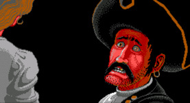
Also the original game makes me think of the Pirates of the Caribbean ride, and that was probably a factor at the time…
[ ](https://earzup-podcast.com/wp-content/uploads/2021/03/Face-2-jail-1.jpg)
[ ](https://mixnmojo.com/galleries/thumb/thumb20190314233536.jpg)
---
### Author:  [@Matt](https://forums.thimbleweedpark.com/u/Matt)
#### Post date: [August 9, 2022, 1:57am UTC](https://forums.thimbleweedpark.com/t/return-to-monkey-island-fan-art/5021/109 "2022-08-09T01:57:25Z")
> [@Sushi](#):
>
> why didn’t we get these kind of graphics in EGA game
I think too, even though they could do 16 colors, they couldn’t do _these_ 16 colors. Only the same garish 16 over and over, im not sure why.
---
### Author:  [@Sushi](https://forums.thimbleweedpark.com/u/Sushi)
#### Post date: [August 9, 2022, 7:19am UTC](https://forums.thimbleweedpark.com/t/return-to-monkey-island-fan-art/5021/110 "2022-08-09T07:19:43Z")
I thought so too at first, but when you zoom in, you’ll see they’ve only used these 16

---
### Author:  [@Ema](https://forums.thimbleweedpark.com/u/Ema)
#### Post date: [August 9, 2022, 9:23am UTC](https://forums.thimbleweedpark.com/t/return-to-monkey-island-fan-art/5021/111 "2022-08-09T09:23:07Z")
> [@BaronGrackle](#):
>
> My brain tells me that the picture above is shorthand, and that there are a lot more details it isn’t displaying.
>
> With the actual character sprites in Return, my brain is telling me the picture is NOT shorthand.
We discussed this topic much time ago somewhere else in this forum. I’m not into art nor psychology, so I might not be qualified for a good answer.
Anyway…
> [@BaronGrackle](#):
>
> Is it the pixelation?
Yes. I do believe so.
When you look at a hi-res image, you see a lot of details. If you look at RtMI your brain immediately understands that the lack of details is just a precise stylistic choice. Some details are very present, some are missing: contours are sharp, there’s plenty of colour hues, and plenty of small details. But conversely shapes are simple and squary, shades are limited and basic, small details are intentionally sketched (eg. eyes). I think this is why the new graphic doesn’t look like a shorthand: yuor brain **knows** you’re see what you are supposed and expected to see, nothing more, nothing less.
So, it is because of pixels, but also because of style.
I mean, just compare the original MI1 graphics with the fan art @LowLevel posted:
I have to disagree, my brain doesn’t see the latter as a shorthand. Or, however, waaaay lesser than the original. And that’s because of style.
In the original art by Mark Ferrari, it was intended to leave room for the imagination of the player. In MM they made big heads to increase the details for the faces. For MI1, they decided to stick to the style of indy3, which had more realistic proportions. So eyes and mouths were sketched just with one or two pixels, so that the player was compelled to use their imagination to “fill the gaps”, to interpolate the pixelated image in building a mental hi-res image. And the close-ups were intended to help the player in this process.
If you compare the game to a book, gameplay images are the text, while close-ups are the illustrations.
This is because the developers had to cope with a technical limitation and had the purpose of building a fantastic world in the mind of the player staying inside the restraints.
The fan art you saw has a different starting point. That fantastic world exists since years in the mind of the artist. He is just trying to depict it, using the old restraints voluntarily, just for fun, as a challenge. But his intent was actually to depict in details his vision, not to leave room for imagination. Eyes and mouth are still a few pixels, but you can see the shapes are more defined and sharp.
It is a more sophysticatd pixel art style, more resembling DOTT style, which is way less “shorthand” that MI style (it shares the same 320x200 resolution, but has the undeniable advantage of counting on 256 colours).
So, to sum up, MI1 style tries to overcome technical limitations using the fantasy of the player, who mentally upscales the pixel world into a hi-res fantasy world.
More modern pixel art styles do the opposite: they try to force the player in a pixelated world, and the player’s mindset itself gets downscaled into the 8-bitish world.
Ant that’s why, in my opinion, game boxes back then where hand drawn, while the fan art boxes for RtMI we’ve seen so far replicate the exact style of the gameplay.
PS:
As I mentioned many times in other posts, MI2 does the same (relying on the fantasy interpolation inside the mind of the player) but using a different technique which proved to be short-lived: MI2 is NO pixel art, it’s just low-res scanned image, hence they simply look blurred.
That’s why I hated MI1SE, but I loved MI2SE. It was like, after 20 years, somebody finally passed me my f\*\*king glasses.
---
### Author:  [@Ema](https://forums.thimbleweedpark.com/u/Ema)
#### Post date: [August 9, 2022, 9:27am UTC](https://forums.thimbleweedpark.com/t/return-to-monkey-island-fan-art/5021/112 "2022-08-09T09:27:35Z")
@seguso’s immediately relpying… I was 100% sure I’d have tingled him about this topic 😉
---
### Author:  [@seguso](https://forums.thimbleweedpark.com/u/seguso)
#### Post date: [August 9, 2022, 9:28am UTC](https://forums.thimbleweedpark.com/t/return-to-monkey-island-fan-art/5021/113 "2022-08-09T09:28:59Z")
> [@BaronGrackle](#):
>
> My brain tells me that, if we zoomed in on Guybrush’s face here (e.g. opening the parrot cage), then we might see a semi-realistic painting of Guybrush’s face, though perhaps slightly different than the one we saw in Secret. My brain tells me that the picture above is shorthand, and that there are a lot more details it isn’t displaying.
>
> With the actual character sprites in Return, my brain is telling me the picture is NOT shorthand. My brain tells me all the details are as I see them, and a close-up version would show me the exact same thing.
IMO it’s not the pixelation, it’s the realism of the face. If the face doesn’t have normal proportions, the brain doesn’t fill in the details.
In DOTT, when Lucas decided to switch to cartoon faces, they also felt the need to increase the face detail and have bigger characters. That’s not a coincidence. 🙂
---
### Author:  [@Ema](https://forums.thimbleweedpark.com/u/Ema)
#### Post date: [August 9, 2022, 10:05am UTC](https://forums.thimbleweedpark.com/t/return-to-monkey-island-fan-art/5021/114 "2022-08-09T10:05:16Z")
> [@Sushi](#):
>
> I thought so too at first, but when you zoom in, you’ll see they’ve only used these 16
I did the very same for MI1 original art, then I checked and saw the palette was standard all the game through.
The illusion happens when the art is good.
---
### Author:  [@Ema](https://forums.thimbleweedpark.com/u/Ema)
#### Post date: [August 9, 2022, 10:21am UTC](https://forums.thimbleweedpark.com/t/return-to-monkey-island-fan-art/5021/115 "2022-08-09T10:21:10Z")
> [@Sushi](#):
>
> So why didn’t we get these kind of graphics in EGA games you may ask? […]
> The answer is simple: to make a game in that style, you would need too many disks as it doesn’t compress like the actual game art did.
Mhm. Maybe you’re right because I’m not into graphics, nor into programming.
But I really thought back then EGA graphics in games was just plain raster files. As far as I can understand, a 16 colours 320x200 EGA image bitmap takes only 32k. (320x200/2=32.000), plus back then image compression was in its infancy.
Anyway, if you’re right, I still can’t figure out why the original graphics should be tinier if compressed 😅 More plain black tones, maybe?
> [@](#):
>
> Artists have better tools available today to pixelate and redraw things - compared to manually placing every pixel with a joystick in 1990.
This was one of the main reasons in my speculation, together with the fact modern artists have much more consciousness of many examples of experience by other pixel artists to refer to.
Like in traditional pictorial art. I might use your same canvas and colours, but if you are the inventor of perspective and you haven’t shared your works, I can’t obtain that result. Even if, technically, I could.
---
### Author:  [@Someone](https://forums.thimbleweedpark.com/u/Someone)
#### Post date: [August 9, 2022, 11:05am UTC](https://forums.thimbleweedpark.com/t/return-to-monkey-island-fan-art/5021/116 "2022-08-09T11:05:35Z")
> [@Ema](#):
>
> back then image compression was in its infancy.
Yes, but they had very efficient compression methods for the (C64/EGA/…) graphics used back then. For example GIF was invented 1987.
> [@Ema](#):
>
> Anyway, if you’re right, I still can’t figure out why the original graphics should be tinier if compressed 😅 More plain black tones, maybe?
Depends on the compression method.
Maybe some SCUMM expert (@LogicDeLuxe ?) can tell us more about the compression methods used in that engine.
Without further information I would say that it was just an artistic decision.
---
### Author:  [@seguso](https://forums.thimbleweedpark.com/u/seguso)
#### Post date: [August 9, 2022, 11:31am UTC](https://forums.thimbleweedpark.com/t/return-to-monkey-island-fan-art/5021/117 "2022-08-09T11:31:55Z")
I made a low-res, nonpixel art guybrush.

It has the same detail of the original. (if it does look more detailed, that’s random artifacts given by the brush)
---
### Author:  [@Someone](https://forums.thimbleweedpark.com/u/Someone)
#### Post date: [August 9, 2022, 11:32am UTC](https://forums.thimbleweedpark.com/t/return-to-monkey-island-fan-art/5021/118 "2022-08-09T11:32:02Z")
> [@Ema](#):
>
> Am I blaspheme if I say I like it more than the original?
And regarding this question: The fan art is really, really great. But to me the scene looks more like a page from a children’s book. For the game Monkey Island I like the original graphics more. They have lesser details, yes. But they have a somewhat more “serious” tone which fits more to the story, IMHO.
---
### Author:  [@BaronGrackle](https://forums.thimbleweedpark.com/u/BaronGrackle)
#### Post date: [August 9, 2022, 12:51pm UTC](https://forums.thimbleweedpark.com/t/return-to-monkey-island-fan-art/5021/119 "2022-08-09T12:51:26Z")
You know what’s funny? Guybrush in this fanart reminds me of the big-head sprites from the later versions of Maniac Mansion and Zak McKraken, as well as Thimbleweed Park. Let me find that Thimbleweed Guy…
…okay, turns out it doesn’t look anything like Thimbleweed Guybrush. ([https://www.reddit.com/r/MonkeyIsland/comments/dps0hi/guybrush\_threepwood\_in\_the\_style\_of\_maniac/?utm\_source=share&utm\_medium=ios\_app&utm\_name=iossmf](https://www.reddit.com/r/MonkeyIsland/comments/dps0hi/guybrush_threepwood_in_the_style_of_maniac/?utm_source=share&utm_medium=ios_app&utm_name=iossmf))
But I definitely agree the smaller heads from Indy 3, Loom, and Secret give a more “attempting at realism” vibe, particularly with the closeups in all three games and Indy 3’s firm connection to a live action film.
Also, as I’ve already started to post elsewhere (i.e. a few posts earlier in this exact thread, because I tend to fixate and repeat myself), I realized this year that the Steve Purcell drawings and closeups have an uncanny realistic-to-cartoonish ratio that matches the animatronics for Disneyland’s Pirates of the Caribbean and Haunted Mansion rides. It was particularly evident when I watched a video talking about how the animatronic Johnny Depp looks slightly more realistic than the older pirate animatronics he’s standing beside. And it’s like… this is VGA Guybrush standing next to Governor Phatt, isn’t it?
---
### Author:  [@LowLevel](https://forums.thimbleweedpark.com/u/LowLevel)
#### Post date: [August 9, 2022, 4:16pm UTC](https://forums.thimbleweedpark.com/t/return-to-monkey-island-fan-art/5021/120 "2022-08-09T16:16:23Z")
I feel a bit guilty at offtopicing this thread, but nonetheless…
> [@Ema](#):
>
> Anyway, if you’re right, I still can’t figure out why the original graphics should be tinier if compressed 😅 More plain black tones, maybe?
The more the dithering (and the more it doesn’t follow clear patterns), the higher the chance that _any_ compression algorithm will create a bigger output.
In MI1 they had to develop a compression algorithm able to handle the dithering that Mark Ferrari introduced to the images, but Mark often used very geometric dithering patterns that were for sure more compressible than more random-looking dithering patterns.
So this sky (MI1)…

… is generally more compressible than this sky (the fan art above):

> [@Someone](#):
>
> Depends on the compression method.
While some algorithms may be better than others at compressing specific patterns, in information theory there are general rules that apply to every algorithm, like: the more the original information is difficult to describe, the more its description will take space.
Originally, the engineers working on MI1 used RLE compression and they had to pass to LZW compression to better handle Mark Ferrari’s dithering techniques. But, _regardless_ of the algorithm, the first kind of dithering is intrinsically easier to describe.
> [@Someone](#):
>
> Without further information I would say that it was just an artistic decision.
I find that likely, still we have no way to say if the chosen compression algorithm and how good/bad it was at compressing random-looking patterns limited in some way the kind of dithering that Mark Ferrari decided to use.
> [@Someone](#):
>
> But they have a somewhat more “serious” tone which fits more to the story, IMHO.
I also perceive and prefer that “serious” tone…
… even more so in these days, because I’m reading On Stranger Tides. 😛
[Previous page](https://forums.thimbleweedpark.com/t/return-to-monkey-island-fan-art/5021.md?page=5)
[Next page](https://forums.thimbleweedpark.com/t/return-to-monkey-island-fan-art/5021.md?page=7)