Thanks for sharing!!!
1 Like
2 Likes
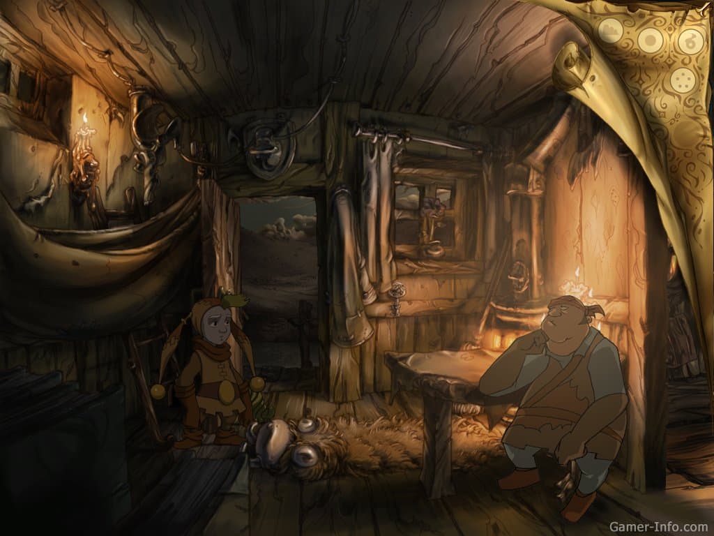
Curse of Monkey Island box art in the new “Return” style.

4 Likes
Well, not Return to Monkey Island and not fan art, but…
2 Likes
Meike Thomas shared this RtMI Guybrush on this tweet.

4 Likes

3 Likes
I really like the original art more than the fan-art-CoMI-style. The latter one is too realistic, too dark and too “serious” for a comedy adventure game, IMHO.
It’s a style that reminds me of The Whispered World:
I would like a more realistic style in a Monkey Island game. I also liked the more realistic close-up portraits of some characters in MI1.
1 Like
3 Likes

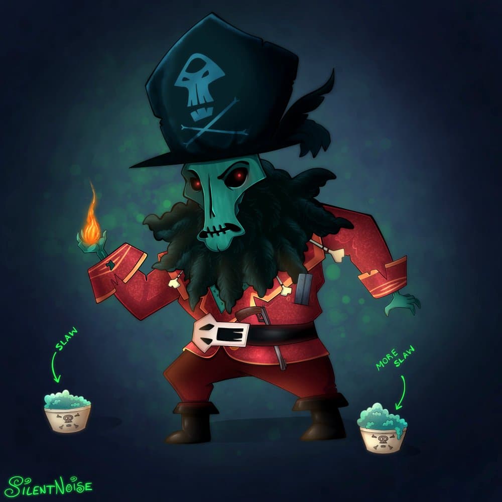
All that discussion about the art style made me read “SilentNose”
1 Like
The entire RtMI trailer made in a real scrapbook! ![]()
By Graam on Twitter.
3 Likes
Now we’re talking! ![]()

By Diego Mory @ghost.pixels
4 Likes
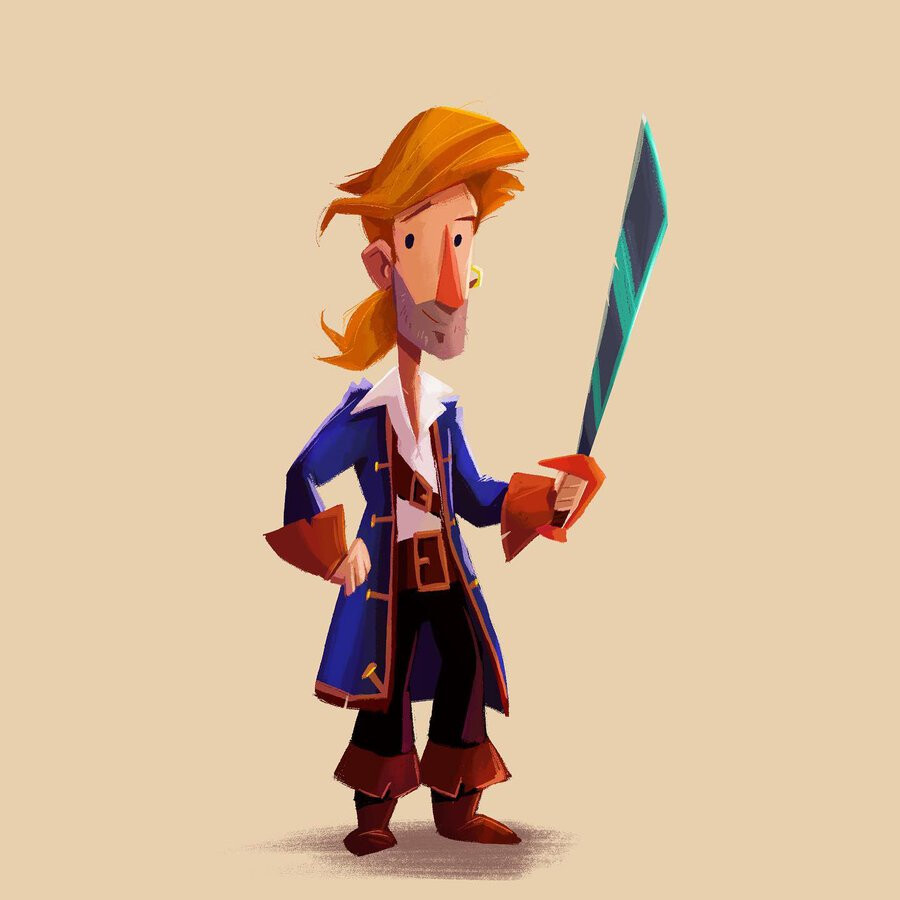
Mighty pirate Guybrush Triftweed by illustrator Paco Vink.
In his Instagram account you can find also a close-up of the same image.
3 Likes
Another one by IamRegg in this Reddit post.
The RtMI jail scene redone in the style of “Curse”:

In the post you’ll find also a version without the characters.
6 Likes
The more I see comparisons between the “old” styles and the current RtMI style, I like the latter more. The CoMI style looks like a (generic) TV cartoon, the “new” art is, how should I say, in some way fresh and new.
1 Like
No need to hate on Curse. ![]()
1 Like
No, no! I really like the game. ![]()
CoMI had its own graphic style. But it was inspired by classic cartoons and RtMI uses a style that isn’t used often - and that fits to the MI world IMHO.
1 Like

8 Likes
A super-lowres doodle with the PICO-8 color palette.
By Matej ‘Retro’ Jan, creator of Retronator, shared in this tweet.

2 Likes
SilentNoise added this returnerized LeChuck to her creations and shared it on this tweet:
1 Like