Elaine should also have a phallic nose. Every character should. Its peak character design.
4 Likes
Actually the original toggle for toilet paper in TWP was over or under.
I believe a toggle “phallic nose over/under” would be wonderfully awkward.
1 Like
I’m learning that people mean different things by “art style”.
I hate the character design. But I’m neutral on the backgrounds and objects.
1 Like
Are you ready to show off your  Elite
Elite  horse armor?
Guybrush isn’t so sure what to do with it, in this drawing by Luca Santu, shared in this tweet.

5 Likes
Creepy LeChuck art created by Adhalia Lux (her Instagram profile)

2 Likes
An entirely different art style, a gorgeous and frightening depiction. And yet still the simultaneous mouth(s). 
No they haven’t used that palette (brown is not in there) and many of the colours are slightly off. Here’s the full SOMI EGA palette using a screenshot from ScummVM with the RTMI one matched to the palette:


The reason it looks better is because it is better than the MI1 EGA art for the same room. I don’t mean the character art. One issue is the excessive dithering in the EGA version. Monkey 2’s scanned artwork also suffers from this, I remember one of the people who worked on it commenting that they didn’t have the required time to clean up all the “stray pixels” in the scanned artwork.
Dithering aside, the major issue with MI1 EGA and why I’ve never been able to sit down and actually play the game that way is that the EGA artwork has no depth to it. The night sky is one issue - in the EGA version is looks like a linear gradient, whereas in the fan artwork it looks more like how you’d expect an atmosphere to look. Better use of colour, better use of contrast overall…
They had GIF as of 1987 and there’s plenty of techniques for compressing backgrounds - in particular tiling patterns.
Mark is incorrect that dither blurs on old CRT computer monitors: it does not. That may be true for Commodore 64 monitors and it is true for consoles plugged into CRT TVs, but you certainly saw the dither pattern crisp and sharp on any decent IBM monitor in 1989.
That’s not exactly how it works. I haven’t seen the under-the-hood code for Monkey1, but just listening from the brief part of the interview it sounds like they’re using a couple of common techniques other companies were using: 1. tiles. So you make a single image that gets tiled as your dither pattern for the sky for example (with an adaptive palette) and it’s the background layer. Then 2. you add on a foreground layer using their custom algorithm that I imagine can do a 1x2 or 2x2 dither tile (hence the awful checkerplate dither everywhere). Anyway whatever they were doing it’s clear that their compression algorithm was built to cope with predictable dithers specific to their artwork style which leads us to 3. artwork is designed with your in-house compression in mind.
I’d almost be willing to bet that none of the backgrounds are full 16 colours as they’ll have reserved a colour for “transparent” and possibly a second to apply a tile.
3 Likes
Is there a way to prove that these very ordered dithering patterns were actually a consequence of the features of their compression algorithm and not because Ferrari simply wanted to draw the backgrounds in that way?
I’m thinking of asking Ferrari directly, it would be interesting to know how much he was limited by the new compression algorithm.
1 Like
True, they used brown instead of dark yellow. I would have substituted some magenta or cyan shade. The other colors are too close for me to see the difference.
Well, that depends. For some games they would optimize for composite connections like you would only have on CRT TVs. On the other hand the decent IBM monitor was meant to show word perfect in a crisp way and used RGB connection.
There’s a nice demo here of both connection types and its results (even using Maniac Mansion as demonstration!)
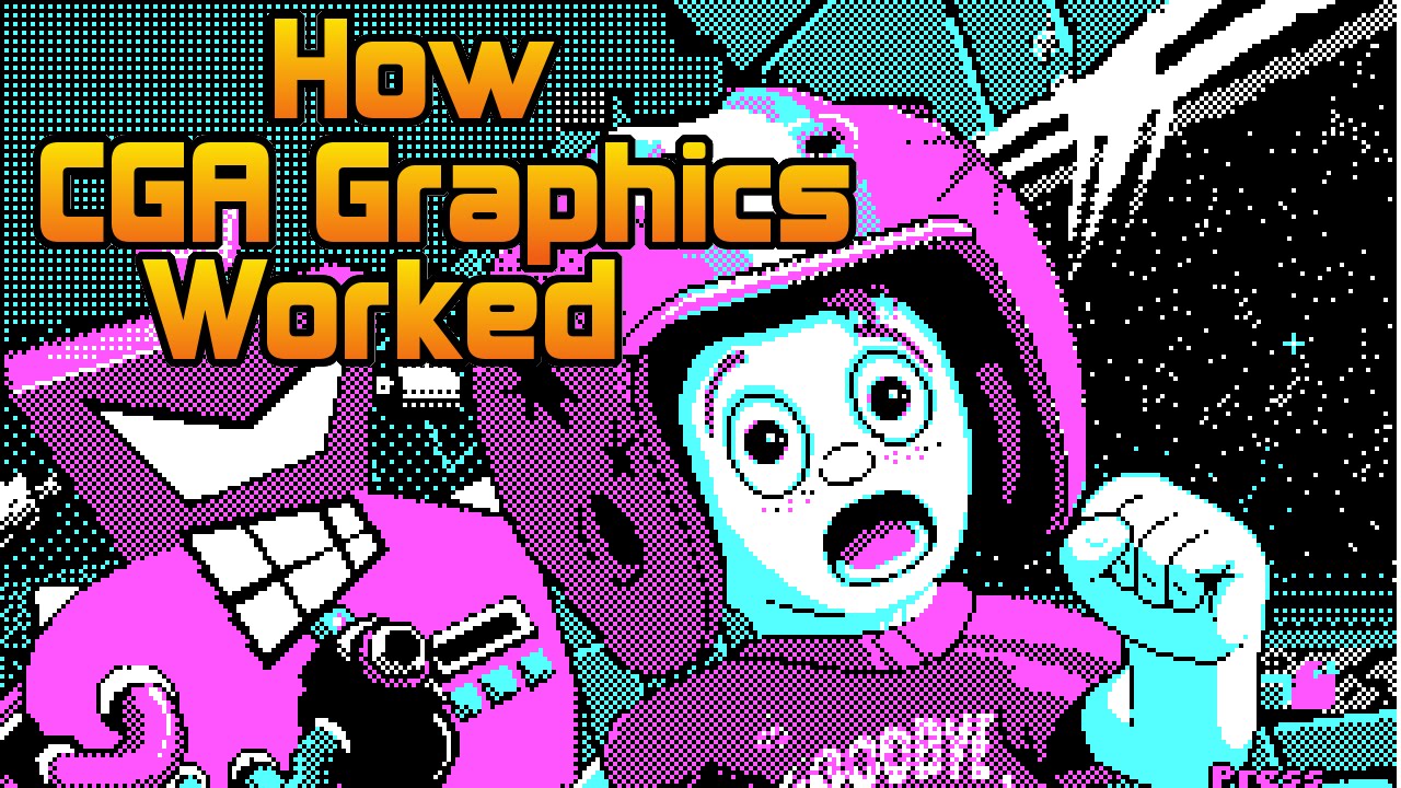
The way some patterns blend are even used to create “new” colors - like brown.
(Okay, the discussion above is one step up as it is EGA instead of CGA, but those effects still apply, making the EGA version looking more like VGA and rendering the dither pattern “almost” invisible.)
4 Likes
IBM PC monitors didn’t have composite, and nor did most PCs (286, 386, 486) have composite outputs they had RGB. It was consoles like NES, Sega Master Drive, Atari, and Commodore 64s (the budget PC) that had composite outputs to plug into TVs. My point here is that designing Monkey Island EGA as a PC game for a 1990 release with dithering intended to blur on the screen and create additional colours as if it were on a TV was the wrong way to design the graphics.
Basically what Mark is admitting in that video is that the graphics in Monkey Island 1 EGA was not designed or optimised for PCs (except for C64s which were obsolete in 1990)!!
I do not know anyone that had an IBM286+ PC in 1990 and pluged it into their TV. It just wasn’t done. PCs cost AUD $2000 back then, and the people buying them had TVs that were often 20+ years old at the time it would be a complete waste to save some cash on the monitor to try and plug it into a TV. Especially when you need the TV for other things like watching TV.
Ok, so just ignore those ancient computers and monitors in that video then.
Admittedly, anyone playing Monkey Island EGA version in 1990 would have seen it on a monochrome display you could switch to either brown or green for the “on” color (black being the “off” one), so it wouldn’t have made any difference. For a fact, iwas the only way I ever did see it running back then, before getting the VGA version about 5 years later.
Even today, those EGA dither patterns blend for me. Not when I put them full screen and sit 2 inches away from the screen. But when you reduce it to smaller sizes by windowing or rolling your chair (waaaay) back - less practical to reach the mouse though.
I must be blessed with eyes with built in blending for higher enjoyment 
That’s not entirely correct. PC graphic cards had composite outputs (even at the end of the 90s). But that wasn’t the majority of course. And the Atari ST needed special monitors. The Atari STE was the first model with a composite output (that could only output some of the graphic modes).
A brand new returnesque Guybrush drawn and shared by adventure game developer Codepassion in this tweet.

5 Likes


4 Likes
LeChuck art by Junaid Chundrigar.
Have a look at his official website for a nice Manny and Glottis illustration and other pop culture characters.

(c) Junaid Chundrigar
1 Like


3 Likes


9 Likes
By azreth, shared in this tweet.

4 Likes