Play the Runaway trilogy. ![]() (It’s a character.)
(It’s a character.)
1 Like
By the way, the map in Fortune Red’s hands gives to me exactly the same vibes of the opening credits of MI2:

(Source)

That’s the kind of gritty style that I have already mentioned in other posts: I have always imagined the pirate world as a dirty one. No doubt, pirate movies have influenced my idea of how this world should look.
While I would like a modern and realistic style for a new Monkey Island game, it’s also true that low resolutions, dithering and reduced palettes of colors used in old games contributed to automatically add a special kind of “grit” to the images.
6 Likes
Backgrounds - just like MI2 but in high resolution and maybe darker / more gritty than Chan’s concept art. I agree with @LowLevel above. I would love if the characters look like that:

3 Likes
That’s very reminiscent of the dark style of “Pirates of the Caribbean” movies.
Despite their colorful graphics, I think that the first two games were intended to somehow convey a creepy atmosphere, when it comes to Lechuck.
Despite? Did we play different games? I thought it was plenty creepy, heh. ![]()
1 Like
I wrote “despite” because I’ve observed several people (even in this forum) not perceiving a creepy atmosphere in those two games and I have attribute this outcome to the role played by the colorful and cartoony graphics.
To me, walking in Melee was a bit unsetting. Suffering from a mild case of coulrophobia, I find the famous alley in Melee particularly creepy, and even creepier in this version.
1 Like
I’d suggest that a gamma adjustment may be required on LCD displays (provided they’re any good at all).
Nice pic. Artist/ source? Or is it Purcell?
Something like COMI would have been great, or the MI2SE which was fairly well done.
Or 3D in which case I would prefer it to be on the cartoony side, something like the remastered Sam & Max season 2 would look very nice too.
I didn’t like the personality/animation of Guybrush in Tales for some reason though.
Yes, the alleyway and the town. And the jail and the forest. And the jungle. It was very much like… well, like stepping off the Pirates of the Caribbean ride and exploring the sets.
The first game and (to a lesser extent) second game had a greater ratio of realism to cartoonishness. Secret of Monkey Island is my favorite art in the series, and I’m pretty sure it’s because it’s the most “realistic”. The character closeups demonstrate that.
And not just the VGA closeups; the EGA closeups are also realistically done, for the technology available. Compare the EGA to this 1989 game, Laura Bow the Colonel’s Bequest: https://encrypted-tbn0.gstatic.com/images?q=tbn:ANd9GcTaCzACaaJ_FFTov10NIMRoHL6aFs7JvyR9AA&usqp=CAU
We don’t think Loom was meant to be cartoonish, do we? Cobb’s EGA facial features are identical in the two games: https://pbs.twimg.com/media/Eop81uJW8AIGp5V?format=png&name=900x900
Of course, the realistically proportioned Cobb has a silly pirate hat on. And silly cartoonish things happen, like Guybrush shoving a giant cotton swab down his pants. It’s a juxtaposition between realism and absurdity that Secret embraced better than any others.
For the longest time, I imagined LeChuck’s Revenge was the same sort of realistic. But actually, it’s pretty much that the ratio is in the other corner. Most characters and closeups have cartoonish proportions, and we now see Tex Avery style animations of eyes popping out, necks twisting, and suddenly-a-wig hair flipping off Guybrush’s bald head. But along with that we see a Guybrush standard sprite that could be interpreted as realistic as the MI1 version, we see gorgeous box cover art with realistic drawings of Guybrush and LeChuck, and we get those realistic illustrations during the title sequence that almost do the job of bringing us back in time! Those intro sequence images, combined with the theme, gave me a bit of an anxious/excited shudder when I first experiencex them.
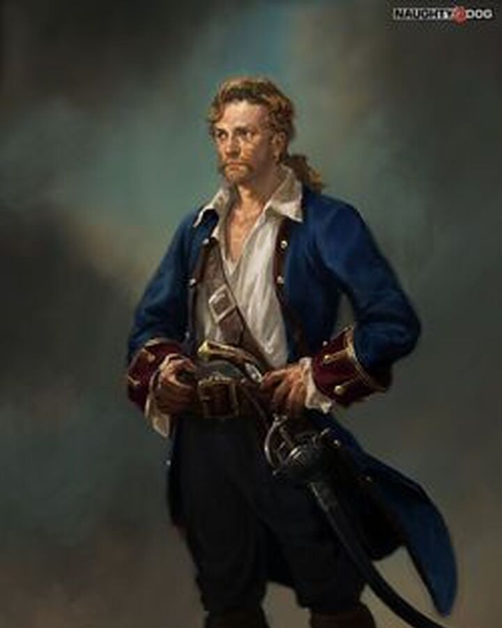
Honestly, I grew up thinking that Guybrush was actually bald in this game with a wig, until very recently when people suggested to me it was just a cartoon effect. It’s hard to tell where the reality ends and the cartoon begins in Revenge. And isn’t that appropriate? There’s a mystique to the realism, and I think that’s why Guybrush’s cameo portrait in Uncharted is so enjoyable. A part of us wants to imagine this would have been what a closeup Guybrush looked like, if Revenge had the same sort of VGA closeups as Secret: https://static.wikia.nocookie.net/uncharted/images/e/ef/Guy_Wood.jpg/revision/latest/top-crop/width/720/height/900?cb=20200505194026
I also really enjoy playing the next three MI games, despite them evolving to 100% cartoon animation style. But because the full transition happens in Curse, I do have a strong association with Ron Gilbert for the realism/cartoon blend of the first two games, and an association of non-Ron Gilbert for the purely animation style. And, despite the compelling arguments for every Monkey Island having a different animation style, I honestly see these five games as two major styles: the realism blend, and the pure cartoon.
In my perfect imaginary world, the art style of the next Monkey Island game would have reminded me of Secret as much as possible. Not necessarily pixeled or state-of-the-art PS5 realism, but something telling me the world wasn’t pure cartoon. My second choice would have been a similarity to MI3-5, which I argue is the same sort of artstyle, as envisioned by three different eras of video game technology. EDIT: I feel MI2 Special Edition also leans to this artstyle and would have been a good option.
2 Likes
That’s a powerful image that perfectly describes the atmosphere that I felt!
I love that portrait and that’s another example of a more realistic style that I would enjoy a lot in a new game.
That line about stepping off the PotC ride is paraphrasing a Ron Gilbert quote, I’m pretty sure. He did a good job of it!
I’ve just seen the trailer for Card Shark and I’m blown away by the art style (and animation). The hands!
1 Like
Frédéric Borallho
There’s another one on that page… and the subtitle completes the creep factor
1 Like
I have discovered that at least for one moment Ron Gilbert has envisioned an adventure game in the style of Firewatch, which is one of my favorite games. That would also be a very welcomed art style for me!
Yeah, I think from a business point of view, I think if you’re going to make an adventure game today, it has to be like Firewatch. It needs to be a big, kind of immersive, quasi-deep experience that people are looking for. I think doing the point-and-click-type stuff, I don’t think there’s really a sustainable mass market for that. There certainly is a sustainable market for it. Like, Dave Gilbert makes lots of point-and-click adventures with Wadjet Eye Games and he seems to be able to make a living doing it. I think he’s kind of nailed his kind of style and scope that works really well for him, and he has a very dedicated audience that is large enough to support what he needs.
2 Likes
I hate it when people say there’s no market for adventure games anymore, because that’s literally the only kind of game I enjoy
1 Like
So bizarre. I loved the game but it barely resembles a real point and click adventure. To think that Firewatch represents the future seems like a time-specific comment, given how outlandishly popular and therefore profitable Firewatch was.
Edited for clarity
That’s possible. That was about the same time when Ron discussed here in this forum how the “old school” stigma attached to Thimbleweed Park kept the game in a small niche, with the inevitable economical repercussions.
He also explicitly mentioned Firewatch and other non-PnC games as examples of styles that would have extended the audience but that wouldn’t please his fanbase:
1 Like
Amazing deep dive. I love this forum more than I love a banana picker in a jail cell.
4 Likes
You should preorder this, then: