Yes, there are several mysteries in TWP. Therefore, I agree with you. The cover ought to look dramatic to a certain extent.
Yes, but the picture LowLevel posted, won’t fit to the -hm- “mood” of the game. The Maniac Mansion cover for example is more sinister than the game. But it fits perfectly to the game IMHO.
The word is tone. Maniac Mansion was tonally perfectly between the dark and the light. The cover art reflects that even while leaning clearly a bit more to the darker side you still get that whacky tone just a little. Thimbleweed Park leans a lot more towards the funny than the dark. This cover is just too dark for the games tone. That´s not what the game is.
Imagine instead of this:
We would have gotten this:

2 Likes
I think that “more sinister than the actual game” is very common and usually absolutely okay, because the cover art has to attract the viewer.
It should just pique the viewer’s curiosity in a way that doesn’t lead to his/her disappointment when she/he plays the actual game subsequently. For this reason, exaggerations are a good stylistic element, because they are often funny and the viewer recognizes mostly that the respective cover is just a teaser.
Also, a cover doesn’t necessarily have to correspond to the game’s contents.
Example #1: The unknown pirates on the MI cover.
Example #2: Exaggerated poses (and muscles).

That couple above could have been Ray and Reyes as well.
Please note the chainsaw and the inscription “low on gas”! ![]()
That whole “who are these pirates”? thing is a bit weird to me. It´s like pointing to the Army Of Darkness Poster saying “who are these skeletons?” I just assume they´re somewhere, but it´s not really important.
But the Army Of Darkness poster is interesting because while the artist managed to capture Bruce Campbell´s facial features (which shouldn´t be that hard, just draw chin with a face on it) but the woman looks exacly nothing like Embeth Davidtz(sp?). Still I think it perfectly captures the mood of the film, funny over the top but still somewhat epic with great action scenes.
The Evil Dead series is notorious anyway for featuring great posters that have absolutly nothing to do with the film. For instance part 2 has that Skull with the eyeballs in it (btw perfectly illustrating that this a funny and scary movie at the same time) and then there is the first film with it´s iconic art of a woman that is not in the movie being pulled into a swap, which also doesn´t happen.
2 Likes
Well, prepare to be disappointed. Personally, I love this art on the box, and it does fit the tone of the game. Everyone who’s seen the box so far loves it. I’m sure some people will hate it (i.e. you), but you can’t please everyone. No matter what you do, some group of people will hate it.
We did a lot of work on a 80s style box, and we felt it didn’t work (there could have been a lot of reasons), so we scrapped it. But I don’t think is tis too far from what you might have found back then. Art never matched what happened in the game.
Hate is a strong word, but if I´m in the minority with my opinion and have so strongly misinterpreted the feel of the game, feel free to disregard my opinion completely.
I loved the way you recaptured the feel of Maniac Mansion in Thimbleweed Park, if the box is where you stop it´s fine by me. I still like the game. If everyone else loves the box it sells and I can save money and you don´t need to worry about me.
That´s a different thing than tone. Bernard never scares anyone by putting a flashlight on his face in MM but that one image was a great declaration of style.
I personally like Octavi´s illustration of Delores more than this cover art. Also doesn´t happen in the game but the feel is more consistent in my opinion.
I can’t make a comparison with “Maniac Mansion”, because I didn’t play that game. My opinion about how dark TWP feels to me is based on the game itself. Basically I didn’t let the humor and the colorful cartoonish art to influence my opinion about the story, which I perceive to be quite sad and serious, if you consider that almost everybody “dies” and even this extreme attempt to escape their digital prison might have been just an illusion.
I can´t share that sentiment in the least. If you approach things this way you can consider The Hitchhiker’s Guide to the Galaxy dark and depressing and sad. Which I assume you do?
I really like Thimbleweed Park. But if I´m supposed to take it seriously in spite of all the fourth wall breaking, references and whacky humor and I misinterpreted it all the way long ie I just don´t get it, maybe it wasn´t a sucess with me afterall…
I agree with you. Most of the background stories were very sad (The death of Reyes’ father, Ransome’s curse and his loneliness, S&D’s wish that things would go back to how they were, Franklin’s death and how he had been treated by Chuck prior, Willie’s problems, Chuck’s fate and the desolate appearance of the factory etc.). Even the music was rather melancholic.
I agree it all comes down to personal interpretation…
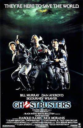
Why do I suddenly think of this
and this
?
Heck, what do I know…don´t listen to me.
Well, you are not alone. ![]() I won’t go that far, that I dislike the art of the picture, but I also have the same opinion about the “tone” (I would still call it “mood”). But I would buy the box (if I haven’t paid for it already ;)).
I won’t go that far, that I dislike the art of the picture, but I also have the same opinion about the “tone” (I would still call it “mood”). But I would buy the box (if I haven’t paid for it already ;)).
Maybe I will change my mind if I see the real box. ![]() (A picture on a computer screen is different from a printed picture.)
(A picture on a computer screen is different from a printed picture.)
Is there a possibility to see the concepts for this 80s style box?
Yes, but as @milanfahrnholz pointed out, it’s about the tone, not the art by itself. (I like the art.)
I don´t dislike the artwork in and off itself either. In fact I think it´s very beautiful. For a different game, but sometimes I think I played a different game than anyone else…is there a achievement for that? There should be.
+1 on that!
1 Like
Well, no, I don’t. The main and most important purpose and goal of “The Hitchhiker’s Guide to the Galaxy” is to make the readers laugh. It’s a parody of science fiction, like “Spaceballs”.
The way we perceive stories is simply subjective, it’s perfectly normal that different people feel different things. To me, TWP doesn’t feel like “Young Frankenstein”, a parody, but a bit like “Fargo”, a black comedy.
Fargo had this movie poster. It is completely different from the TWP box art. And I agree with you: The Fargo poster would work for TWP too:

Which begins with the destruction of planet earth, kills off several likeable characters and touches on several philosophical and scientific topics in a partly serious way. I don´t see the difference.
TwP doesn´t feel like Fargo to me at all. More like Men In Black (which also has more somber aspects like when the Agents have to give up their former lives completly)
He he, yes I thought the same after reading some of the discussions in this forum too. ![]()
But LowLevel is right: Douglas Adams admitted in an interview that he had just string together some jokes for the Hitchhikers Guide…
No. All that would invite is everyone to second guess our decision even more. And it’s not just this forum, I won’t ever show people concept art where big decision had to be made, it just invites second guessing.
I love the box art, it fits the mood of the game perfectly. If this art had been used day-1, no one would be giving it a second thought (like Maniac Mansion and Monkey Island).
I’m sorry you don’t like it. We like it a lot.
1 Like
As I wrote above: I like it and I would buy the box (if I haven’t that already. :)).