Maybe Ron secretly hates the style by now…
What I don’t understand is why people are so upset with this art style while also being fond of the Special Editions, which in my opinion are not only ugly as hell, but don’t do any justice to the original games.
And those were the original games, not a new one created from scratch. Which makes it even worse.
4 Likes
I kind of got the impression that they hate all styles post-MI2. ![]()
1 Like
Are there a lot of people who love the Special Editions’ art? I hear MI1 special edition maligned a lot.
The existence of the Ultimate Talkie Edition itself is the answer to: “How can I hear Dominic’s voice while still looking at the old pixel art?”
There’s even a patch to “fix” Guybrush’s hair, isn’t there?
1 Like
Both MI1SE and MI2SE have “Overwhelmingly positive” reviews on Steam.
The fact that they are the original MI stories and that it’s possible to play the games with the old graphics should be taken in account, of course. But their art style hasn’t stopped people from giving them excellent reviews.
Maybe some people find that “straightforward” art style more digestible than very stylized art. I’m one of those who like MI2SE background art and I can understand those positive reviews.
I’ve seen several people who lamented RtMI style saying something along the lines “Why didn’t they use Curse’s art style”?
I believe that “not being MI1/2 style” is only a minor part of the critiques.
It was. The same is not true for MI2SE, though. They fixed Guybrush’s hair. ![]()
I personally wouldn’t have objected to the art so much, if they’d kept the verb interface and inventory on screen. The control scheme was so clunky, I had to switch to the original art, because I could not beat one of the more time-sensitive puzzles (at least it would have taken more effort than I was willing to muster at that time).
1 Like
I myself would give the SMI special edition a very high review. All I have to do is press select on my PS3 controller.
If only I could press select when watching Star Wars, and make Greedo not shoot Han. ![]()
If you could change the RtMI art style with that of Simon the Sorcerer Origins (see below), would you change it?
- Yes
- No
0 voters


I accept your poll, but I want to specify that I would not change RtMI style with this peculiar one that I dislike. But that doesn’t mean I think RtMI is the coolest one.
2 Likes
After being at war with myself over this for a few months now (in regards to “I love everything except the art” versus “but oh man that art”), my preliminary conclusion is that I could do this game if only the characters had actual eyes.
“But Grackle, they didn’t have eyes in MI1 or MI2…”
They did for zoomed-in shots in both games, and for reactions in MI2. The old pixel art was understood as a placeholder because there were more details when you zoomed in. This art remains the same when zoomed in… these characters are scrapbook paper instead of flesh and blood.
That’s where I am and where I’ve lived the past few months.
1 Like
For the dark tones that I would like a Monkey Island game to show, the actual art style of RtMI is definitely more appropriate. Sharp edges, caricatures with disproportionate elements, facial features that I even find grotesque, some strange camera angles… all works together to convey a sense of uneasiness that I’m glad the game is conveying to me.
It’s still a “meh” style for me in general terms, but the other one that you suggested takes sugarcoated paths that are even farther from what I would have liked to see.
1 Like
If I could, I would fix the perspective issues in Simon the Sorcerer Origins - just looking at those picture frames on the wall makes me disoriented . And I’d make the characters feel more integrated with the backgrounds in style.
(Even if you don’t like RtMI style, you can’t deny its consistency)
But I can’t draw more than a square or a circle, so you’ll all have to accept both games as they are. ![]()
1 Like
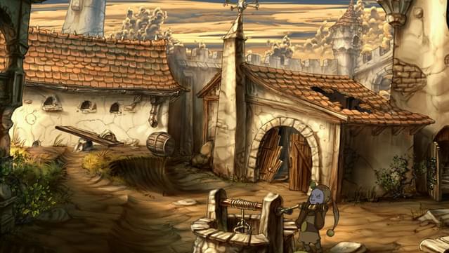
I’ve discovered this rendition of the SCUMM Bar, made by Bill Tiller, that I didn’t know:

Since the look of the SCUMM Bar in RtMI was recently disclosed in a video clip by the developers, I thought it would have been interesting to appreciate a different take on the same subject.
Which of the two images do you like more?
For reference:

3 Likes
I really can’t decide. The art style is too different, IMHO.
But I have to admit that Bill Tiller’s picture doesn’t look like a Monkey Island game. It reminds me more of a Deadalic game like The Whispered World:
The current RtMI style has the “Monkey Island atmosphere” that MI1 had.
1 Like
I’m not sure what you mean by that.
The style of that image is Curse’s, so do you mean that to you Curse didn’t look like a Monkey Island game?
1 Like
in the first one I don’t like the colors and the lighting. Reminds me a bit of Discworld, but worse. It is a perfect example of how details don’t make a good location. The drawing is nice though.
The second one is decent until you look at the crooked, Escher-like dock in the distance. I am going to swear to God each time I walk on that dock.
Partly, yes. Some scenes of Curse are looking more like a Disney movie.
1 Like
I’m learning that I only hate MI6’s character art. The background art and such doesn’t agitate me.
EDIT: To answer your question, I see them almost equally, though the Tiller art has an advantage of about 25 years of nostalgia. And my natural preference for Disney’s renaissance era of animation. I prefer the Tiller one, sorry.
The second one. Just a feeling.
The same thought crossed my mind as well. I mean from the curly clouds and general style, it absolutely looks like Curse. But with its gloomy, night-time look and general color scheme, it absolutely doesn’t.
The second image pretty much mimics the MI1 color palette, give or take. So to me it comes closer to what I connect with being the Monkey Island look.
Maybe my brain is more fixated on colors than shapes.
Given the above, clearly the bottom one. While both depict the same scene at night-time, I find the bottom one looks friendly and inviting, while the top one looks bleak and dreary. Though I do appreciate the extra detail present in Bill Tiller’s rendition.
1 Like