I’m trying to think of another artist who draws noses as cutout shapes like that, but I can’t come up with any examples.
I just want to know why her chin is so pointy
You guys ever watch King of the Hill? Cotton. Hank’s dad.
Using simple geometric shapes as building blocks, reminds me of low-poly videogames.
While they’re not 2D and the final result is quite different from RtMI’s, both styles share a stylized approach and intentionally avoid too many details.
Kentucky Route Zero is a game that comes to my mind and that uses flat shapes as their primitives. It has even less details that RtMI:

Stylized styles in games are not new, you can find many examples in this quick search on Google Images.
2 Likes
If I remember correctly, Ron said somewhere that he liked Kentucky Rout Zero much. Maybe that game was an “inspiration” for the RtMI style (too)?
1 Like
That’s possible. Ron praised the game in more than one interview, in the past. In this forum he also said that it saw that kind of game as a natural evolution of “PnC games”:
2 Likes
That’s funny… identifying the stigma against point and click games as “puzzle logic”.
But Return is very clearly going to have that same kind of puzzle design, right? Surely?
Yes, they have mentioned puzzles in a way that makes me think they’ll be “classic” puzzles.
Unless you use the Passive Mode, which both substitutes gameplay with a two-hours slideshow of static scenes and repeatedly explains to the player how to press the “A” button to advance the story. Passive Mode is the default.
2 Likes
This reminds me of the many UI we had imagined years ago in this forum. ![]() One of them had a single button “solve this puzzle”. When pressed, it asks you “Are you sure you’ve already solved this puzzle in your mind? Otherwise, you are cheating. Press again to continue (the puzzle will be solved automatically)”.
One of them had a single button “solve this puzzle”. When pressed, it asks you “Are you sure you’ve already solved this puzzle in your mind? Otherwise, you are cheating. Press again to continue (the puzzle will be solved automatically)”.
I still have to hear a convincing explanation of why this UI is worse than what we have now ![]()
3 Likes
Hey, I could go for an “Are you sure you want to win? [Y] [N]”
And it would be crazy easy. Most games nowadays have a menu with a “Credits” option. Just keep that, but change the text to “Win the Game”.
1 Like
Monkey Island had such an option. ![]()
2 Likes
Thimbleweed Park had such a dövice.
1 Like
Important question that I haven’t seen asked:
is this art style going to age well or poorly? In 20 years, how will we look at it?
I think that stuff ages poorly when it’s trying to do more than what’s plausible.
An example, a movie like Toy Story in my opinion aged perfectly when it came to toys, and poorly when it came to humans.
RtMI isn’t trying to do something cutting edge, it’s just a precisely defined art style, and those don’t age in my opinion.
6 Likes
Right, stylized things don’t age, because they can’t be compared to anything. You can only age if you can be compared to something more recent of the same kind. but if you’re one of a kind…
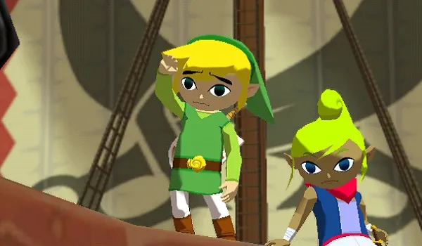
People like to bring up Windwaker, because apparently it was hated on release but grew to be loved by fans. So I hear. I was never a Zelda fan.
But I like that comparison because, even though Wind Waker looks like this: Wind waker image
The newest Zelda game looks like this: Breath of the Wild
That calms me down in that it argues: even though Zelda fans may hold a special place in their hearts for cutesy Toon Link, they didn’t love him to the extent that Actual Link disappeared.
I’ll be pleased as punch if, twenty years from now, Monkey Island fans remember Return as having some of the best art in the series. That’s fine.
But I’ll be sad as a clam if the art is an immediate hit, to the extent that we get a whole bunch of MI sequels with characters looking the same, and Rex Crowle becoming as entrenched in the franchise as Michael Land and Dominic Armato. It would break my heart if Disney suddenly made a bunch of Guybrush Threepwood merchandise affordably available (for the first time in franchise history), and it all looked like his depiction in this game. That’s my nightmare scenario.
Despite liking the art style, I’m 100% with you on this one.
I think that this art style will age well. I’m convinced that it will be positively remembered as “the strange one”.
I think that it’s highly unlikely that a franchise that has changed style at every turn will suddenly define any style as “the one” to go.
As with every previous game, it’s just a temporary phase. It might last for a few years and it will slowly fade in time, especially if a new game with a completely different art style will be made.
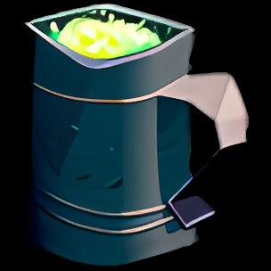
I’m OK with them using the new style for merchandise. I don’t think that I will actively search for goodies depicting this new Guybrush, but I might be interested in other things, like a mug with some illustration:
2 Likes
I just worry because Ron Gilbert fell in love with this art style in… what, 2009? I’m afraid of how attached he might have gotten to it.
Nah… he likes more to innovate and to take people by surprise.
Also, I wouldn’t necessarily assume that Ron will have a role in the development of a future MI game.