Mmmm… as I feared: I don’t care for Nosebrush Threepwood.
But the rest looks really cool!
Although some fast-walk(?) animation feels too fast-walky.
1 Like
In the absence of news, some idle thought about the art.
Someone argued the vector style of RtMI characters can be considered a natural continuation of the pixel art style, because it has the same level of detail. For example: in pixel art, eyes were one pixel. Now, eyes are one dot. And that’s fair enough.
So the new style leaves to imagination, as much as pixel art. Because the low level of details unleashes our imagination. Fair enough.
But, for all this to work, it’s needed that characters are never zoomed in. No closeups have to occur. They need to remain small. And yet, one of the features Ron mentioned is the dynamic zoom on characters during dialogs or in precise scenes.
(Second: arguably, as some of you pointed out, in order for imagination to add detail, it’s needed that the characters aren’t deformed, but they have to be low-detail versions of realistic characters. That’s why, in DOTT, when they switched to deformed characters, they also increased the detail, making the characters bigger. They realized our brain couldn’t fill in details anymore.)
3 Likes
Why?
Ok, if you zoom into Guybrush’s nose then you would see just some lines. ![]() But the characters are showing enough details to do some, for example, over-the-shoulder shots.
But the characters are showing enough details to do some, for example, over-the-shoulder shots.
1 Like
Why: I offer as evidence the fact that, in Monkey2, near the fisherman, where Guybrush is bigger, they felt the need to redraw it from scratch.

For some reason, low detail doesn’t work in closeups.
1 Like
You can clearly see in the trailer that regardless whether the detail is always there but hidden by being smaller or whether it’s dynamic (don’t feel like freeze framing and pixel peeping atm), they’re plenty detailed in close-up. ![]()
1 Like
These are two different things: (very) small pixel graphics haven’t the details that vector graphics have(*). You can zoom into vector graphics more than into pixel graphics until they look (very) ugly.
(*) well, could have. ![]() But in RtMI there is enough detail to zoom in, IMHO - see @Frenzie s answer.
But in RtMI there is enough detail to zoom in, IMHO - see @Frenzie s answer.
No, man, I wish it were true, but it isn’t…

This is a low detail character, eyes are one dot, but it’s a closeup.
Hopefully it’s fast and very animated, so the problem won’t be noticeable. But still…
2 Likes
But it’s still working - at least for me. Yes, the eyes are dots (that’s part of the graphics style), but have a look at the eyebrows and the small light lines above the nose. Or the hat and the earrings.
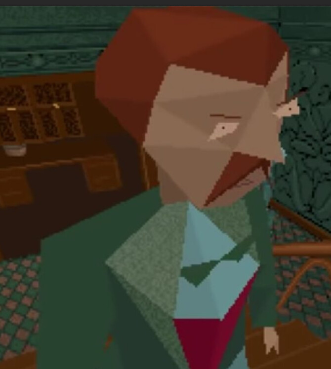
Just to understand… this is Edward Carnby’s closeup in Alone in the Dark:
If I add small lines along the eyes and nose, now it works for you?

2 Likes
You are still comparing completely different art styles. And yes, the first close up from Alone in the Dark looks good (given that we have a game from 1990). And now try to zoom into Guybrush from 1991:

When I played it in 1993 or so, I remember most people agreed those closeups should have been avoided, and looked bad. Even at the time. Luckily, for most of the game the character is small. (which fixed it )
Not me. I liked them. ![]()
1 Like
No, no; not that. This:
The pixels were presented as a stand-in.
1 Like
I remember only people complaining about the camera angels. ![]()
1 Like
I do think my “coping mechanism” is going to be imagining this as Guybrush’s own drawings and memories, crafted together after the fact.
Either that, or his fantasy world gradually converting reality into abstract over the course of several years, through each game until this point.
As with all shifts, the fanon mind bobs and weaves to interpret a version that functions for himself.
2 Likes
What an ugly nose. ![]()
1 Like

Was AitD from before they figured out that the direction should be kept the same if you kept holding the button?
The one I specifically remembered was Murray btw.
Aha, that’s why the tip of his nose is red now: they’ve used this as color reference!
Of course those pixels were always meant to be viewed on a CRT that blends pixels and colors to create the illusion of two eyes and a nose with some form and shade below. Plus two lips on his mouth.
You simply cannot compare the style and techniques.
I bet there are more pixels in that “one dot” than the entirety of EGA Guybrush.
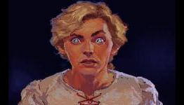
In the closeup of Carla, you can see the dot isn’t even round (or square)
Admittedly, the eyes have no color or shades- it is all black and a blob as a shape, which seems fitting in with the paper doll style. If you were to replace them with detailed eyes and color, you might end up with that same mismatched eyes as in Alone in the Dark.
Now, I am not a big fan of the black eyes though- there’s a reason sharks and crows are scary looking. Or vice versa, human characters with pitch black eyes feel alien/evil/…
And to think Elaine always had nice eyes.
But still, with half of her face covered by a blade and pitch black blobs for eyes, the closeup of Carla conveys emotion, thanks to the shading and wrinkles on the forehead and the bright lines below the eyes as if there a bit squeezed. And the eyebrows do most of the talking.
2 Likes