Remastering old games: do more resolution and colors make the graphics better?

I was reading an article mentioned by Ron on Twitter, it’s a recent interview of Brian Moriarty, the author of the Lucas game “Loom”.

When asked…

Would you ever like to see Loom remastered with updated graphics?

… he answers:

If by “remastering” you mean simply converting the original low-resolution 16-color art to high-resolution 24-bit color, my answer is a loud “No.”

Nearly every creative decision regarding the dramatic scope and presentation of Loom was influenced by the severe technical restrictions imposed by the available hardware. Adding more pixels and colors would only serve to emphasize those restrictions.

The 256-color “upgrades” of Loom produced after the original EGA release clearly demonstrate this. They not only make the original design seem unduly antiquated, but also manage to obfuscate specific experience goals by adding superfluous colors and detail.

What do you think about this? Do you think that adding more colors and using smaller pixels inevitably highlights in a bad way those graphic features that made sense only for those limited computers?

Here Brian uses the word “converted” and makes the example of the 256-color version of Loom, in which more colors were added to the original scenes, but what about completely redrawing the background art? Might that be an improvement, assuming that the artists are very good?

I’m a bit torn about this, because for some “remakes” I did like their new graphics.

1 Like

The same as Brian. The game design is influenced by the graphics and vice versa. I’ve played the 16 and 256 color versions of Loom and yes, there is a difference - at least for me. In my opinion the mood changed: If you look at the left picture, the scene has a blue tone, where the red leaf shines out. The right picture is more grey with this yellow shine. It’s subtle but the mood changed. And the higher the resolution the bigger is this difference. For example Guybrush in MI3 isn’t the same as in MI1 or 2.

That would be a more Interesting question if the original artist would redraw the scene.

What happens if other artists are redrawing the graphics you can see in the Special Editions of MI.

Can you give an example?

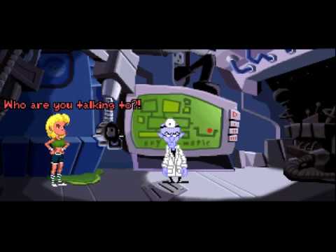
In my case, I can safely say I enjoy Day of the Tentacle more in its new high-res version, and with the pie interface rather than the verb interface. The reason I prefer the pie interface is because by removing the verbs and inventory at the bottom, they can scale the image to fully fit the screen. Although I would’ve preferred the pie to always show all verbs, rather than only the usable ones.

For me, that game is something I played years ago. I have fond memories, but those memories have smoothed out the pixels and made the characters more “real”, insofar as this label could apply to a cartoon. To me, the high-res remaster looks exactly how I remember the game, with the pixels smoothed out by age. The original shapes are retained, the animation is the exact same, just higher res.

If a remaster can achieve this, then yes, bring on the remasters.

(EDIT) I also believe not all games can benefit from this treatment. I don’t think it would make much sense to do a high-res version of Maniac Mansion, for example, because the movement would stand out as really antiquated when drawn in higher resolution. By playing that in one of the original resolutions, whichever you prefer, you learn to appreciate the game more because the original resolution forces you to pay more attention to the game itself.

In my opinion, most remakes and enhanced versions look nice, too, but they have an influence on the visual appearance of the game. The Monkey Island Special Editions look so much different that I can understand Brian Moriarty’s point of view. It’s a different game.
That said, in some cases the original creator consents to the changes. Al Lowe, for example, who created the Larry series, did a remake of the first Larry game himself, which looks completely different from the original one. Therefore, the original creators seem to have very different opinions on this topic as well.
Moreover, Tim Schafer created the enhanced version of DotT himself. But, I admit that the “Remastered” version has been very conservative in terms of the graphics. Most people might be okay with these changes.

I personally think that the MI Special Editions have caused that the original versions are played more seldom, which is sad, because they are still very enjoyable and even have a historical value. That said, the Special Editions might have attracted people who probably would never have played MI 1 & 2 otherwise. There are people out there who dislike low-resolution graphics in general, just because they think that it’s obsolete.
I think that, if you create a remake, you should include the original version, so that the player would still be able to check out the origins of the game he is playing.

Absolutely agreed. It doesn’t cost much extra, helps preserve history, and gives fans who dislike the changes in the high-res version an alternative way to play the game that’s agreeable to them.

1 Like

Fortunately, the MI Special Editions do have the original game still built in–mostly. I recently played through the MI2 Special Edition in its entirety using only classic mode.

In my case, I like Sierra’s VGA remakes of some of their older adventure games. They did a complete overhaul, not only redrawing everything, but switching from the text parser to their icon-based mouse interface. It probably helped that they had other VGA games within each series that they could conform to. If Monkey Island 1 had been a Sierra game, the VGA remake would have given it the Monkey Island 2 art style.

I’m a big loom fan. I think the new graphics works better because they added color, not details. (I have this fixation that high-res blocks imagination. but more color does not)

I also don’t see how more color can make it more apparent that the rooms design is antiquated. Yes, with more colors they would have drawn the rooms in a different way. But it does not follow that the rooms they did are better with few colors.

I agree, using more colors in that way changes a lot the kind of atmosphere that the scene conveys. In my opinion, in this specific case colors weren’t used in a considerate way, because the original scene war probably darker for a reason and adding light and colorful details changed its mood and drives the player attention to irrelevant elements.

Maybe I’m reading in Moriarty’s opinion more than what he’s actually saying, but to me it seems that he is also referring to the composition of a scene and the fact that it was chosen as a consequence of the technical limitations of old computers.

All these remakes basically take the same scene and redraw it with more colors and at an higher resolution but the composition of the scene remains always the same: it contains the same elements, the point of view is the same, the perspective is the same, the depth of field is the same, etc. It’s my understanding that these aspects as well might have been chosen as a consequence of technical limitations.

For example, the decision to draw a “flat” scene with almost no perspective, like the one of the Melee docks…

image

… could have been influenced by the fact that the only kind of camera movement that could have been simulated back in those days was panning (at least in the sense that the term has in 3D graphics). So the character can move left or right to reveal a longer scene but since you are just scrolling a static image, the perspective must not change and that means that in this case they had to draw a “flat” scene.

(actually, there are ways to simulate a change of perspective using just a fixed image and panning, but let’s assume that they didn’t want to do it)

With today hardware capabilities and 3D graphics we no longer have to impose these restrictions to the artists’ imagination: the backgrounds could be completely recreated from scratch, using different contents. The result would no more be a “remastering” but a “remake”, as the two terms are used in cinematography.

So one of the things that in my opinion Moriarty is implying is that if you just add more colors but keep the scene exactly what it is, it doesn’t make sense because, regardless of colors and resolution, the contents were also chosen because of the old limitations.

I like the backgrounds (and only the backgrounds) of MI2SE. I emphasize the “2”.

5 Likes

But they did add details. Just observe the comparison of the two versions that I posted. In the old version the scene is clearly a nocturnal one and everything is under shadows while in the new version everything has been lighten up, resulting in more details shown.

That would look like this (website):

Or like this (website):

My only issue with this statement is the use of the term “old limitations”. If I wanted to make a 2D adventure game right now, having access to a CPU, hard drive, and memory that is well over 1000x better than what was available in the 1980s doesn’t change the fact that a 2D engine and art style have inherent limitations. Why would having access to more pixels and colors change the perspective I’d choose for drawing a scene?

Based on what I’ve seen of the EGA and VGA versions of Monkey Island 1, adding more colors can be done without drastically changing the visual look of a scene. The problem with your Loom comparison earlier isn’t that they added colors, but rather that they changed them.

2 Likes

Funny you mention Loom as example of (negative) side-effects in converting it to 256 colors. That version even had to cut some close ups from the EGA version- for disk space reasons and to be honest, to fit the talkies.
What Brian meant according to me is that the inherently “simple” and “clear” style of the EGA version, which was enforced by hardware limitations is lost to a certain degree by upgrading to 256 colors and would even more by converting it to a 24-bit color space. It’s like painting a lego figure in too many shades… it just loses it attractive essence.
As another example: the FM towns version of Zak McKracken is making the original (C64!) look antiquated (which is why they sell the FM towns version on GOG, just to get “modern” players to not simply discard it over its old graphics), but on the other hand it is obfuscating which objects or areas on the screen you can or should interact with. For example the living room in Zak’s appartment has simple single-colored walls and floor, through which the player’s attention is drawn to the objects: a TV, a couch with cushions. In the FM towns version, there is this very busy patterned floor rug detracting all your attention, detailed wall papers,…
(Note: luckily the CGA version is included too)

Hand-drawn looks great. I dunno. When seeing the original Purcell concept art for Monkey Island, I think it would rock so hard to see a game like that.

Then again, while I’m not against remakes per se, I’d rather have a new game with a new look if needed.

Brian wrote:

If I could actually RE-DESIGN Loom for modern PCs, the result would bear little resemblance to the original game. It would look like Kubo and the Two Strings, and play like conducting a symphony.

So he is “open” for a re-design, but the result would be completely different. (btw: They made several Larry 1 remakes: Larry 1 was the remake of the text adventure, then there was the Sierra VGA remake and now the Reloaded remake.)

Yes, the VGA graphics were far better than the old SCI versions. But for me they a) hadn’t the charm of the old games (especially compared to the AGI games) and b) were “easier” due to the fact, that you only have five(?) commands. So they shared the story and the puzzles but I would say that they are “different games”.

Not better. But they have a different atmosphere and mood.

After reading the interview I would say that Brian is referring only to high-res versions of the old graphics (= scaled up and more colors). He gives the example with the VGA version of Loom.

btw: Nice painting of Guybrush. Where do you got that from?

You can do tricks like panning and zooming in real time, you can use different layers (parallax), etc. Disney has used a lot of them in their films. Then there are cell shading techniques where you can let a 3D world look like a 2D scene but with the advantage that you can move the camera in all directions.

Thimbleweed Parks used some of those tricks, but they didn’t stop the game from having that retro feel Ron was going for. Sure, it’s not 100% authentic to the era, but if Thimbleweed Park were to receive a “demake” version that was truly authentic to the era of early VGA adventure games, it would look only modestly different. It wouldn’t suddenly become necessary to completely redraw all the art to make work within the limitations of a 320x200 display with 256 colors. The perspective used for the scenes would work just fine, whether Thimbleweed Park was made today or over 25 years ago.

To look at a different game, the original Monkey Island has its share of fancy camera angles. Being made with 16 colors didn’t stop the game from having close-ups, aerial views, perspective shots of buildings, and even an at-the-camera shot of getting fired from a cannon. I just don’t see any evidence that the composition of scenes was the result of color or resolution limitations. If Ron were making Monkey Island for the first time right now, I could see those shots still being composed the same way, even if color depth and resolution would allow more creative options than what was available back then. Some things would undoubtedly have changed, such as perhaps having the aerial view of Monkey Island scroll more responsively, or perhaps just rendering the whole island in one shot.

Looking back at that Loom comparison, I’ve seen many movies that make use of the moody nighttime lighting seen in the EGA shot. I’m confident that the same sort of coloration could have been done in VGA. As it is, Monkey Island did that in the VGA version. Melee Island was still bathed in blue nighttime lighting like the EGA version was, but they had more colors to do it. They didn’t make the mistake of completely recoloring the scene as seen in the VGA side of the Loom comparison shot.

When I wrote “the only kind of camera movement that could have been simulated back in those days was panning” I was referring to the limits of memory and graphic cards/CPUs, that were unable to perform complex graphic operations or memorize very big sprites. As a result, even the composition of a scene was influenced by those hardware limitations.

For example, let’s say that an engine doesn’t have at all the ability to scale on-the-fly the character sprites, due to hardware limitations (did the SCUMM version used for the original “Maniac Mansion” have this ability? I don’t know). If the engine has this limitation, the graphic artist is forced to use a very specific and fixed perspective for the whole game, because he doesn’t have a way to draw smaller versions of the characters sprites to simulate a greater distance from the camera.

You can take a game with such graphics and just add colors and pixels, but you should remember that today you are no more forced to use the same perspective that the game used in the past, which wasn’t just an artistic decision but also/mainly the result of a technical limit.

So, Moriarty was probably referring only to colors and resolution but I still think that the choices of the graphic artists of those old games were influenced by the limits of hardware in other ways as well.

I agree, they added a lot of unnecessary details and changed a lot of colors, changing also the mood of the scenes.

Yes, he was referring only to these two aspects. I made above an example of other limitations that in my opinion did also limit the composition of the scenes.

Unfortunately this time I wasn’t able to identify the author of the fan art. I don’t remember in which website I found this image.

1 Like

The following (and quite known) fan art is my current desktop wallpaper, though, and it was drawn by Feng Zhu Design:

4 Likes

People tend to become attached to the first fully realised conception but if they were presented with another at the time then they’d like that one more instead and the idea of remaking or remastering it to what we currently know and love would be frowned upon by many.

For a faithful remaster, I think it’s imperative that the core essence and mood of the locations remain as were, even if a new concept might be better in a vacuum where experience, biases and nostalgia are stripped. DotT Remastered is the only game that successfully honoured the original core essence almost absolutely, while improving the original concept. There is more deviation in the other remasters which I’ve seen (though they are still largely faithful) which begs the question: why bother? Remasters which use more artistic license and deviation get caught in a no man’s land where it’s not really doing one thing nor the other. Either be faithful to the original as tightly as possible and honour even the flaws and limitations or do a serious remake, where you recreate the game visually while retaining the plot and solutions, of course. At this point, again it begs the question: why bother? Just make a new game.

Games have their time.

Move on and create.

1 Like

And to answer the OP, it makes graphics different. The rest is subjective. Though not remakes or remasters, as an example: I could never get into the CGI animated movies as I did the cel animated movies. This example goes beyond mood and essence. There is some deeply inbuilt bias regarding the two approaches - in the same manner one might feel about pixel art vs otherwise. Whether it would have manifested were the order reversed in terms of my experience in watching animated films, I don’t know.

1 Like

The lack of dynamic scaling does not equal the inability to show characters at multiple sizes. it’s simply a matter of drawing the character at different sizes. Indiana Jones and the Last Crusade did this, by having their normal full-size characters for normal scene interaction, but then drew smaller top-down sprites for navigating the catacombs and Castle Brunwald. They also drew a smaller side-view sprite for on scene early in the game, and a separate top view sprite for one of the three trials at the end of the game. I also recall a special sprite that was used for just one optional puzzle scene. The lack of dynamic scaling didn’t prevent that game from using whatever perspective views they needed, and early Sierra games frequently did the same thing.

Even with dynamic scaling, I never really saw evidence that it dramatically altered how scenes were laid out in later games. The Fate of Atlantis had the benefit of scaling that The Last Crusade didn’t, yet The Last Crusade still was able to show expansive scenes with lots of potential depth. Admittedly they used some simple tricks to hide the absence of scaling, but even games with scaling used those same tricks as a form of fast travel to avoid unrealistically fast characters or tedious waits for characters to traverse long distances. And lots of scenes in those games didn’t absolutely require the scaling. In fact, I remember getting annoyed with scaling on many occasions, because even in smaller rooms, it was easy to move the character just a little too far to the rear of a room and end up with annoyingly reduced detail on the character, when keeping the character full size would not have caused any appreciable scaling mismatch with the background.

As it is, sprite scaling came along so early not many LucasFilm/LucasArts games had to do without. Out of the few games in their library that didn’t have it, I can only think of two that really suffered graphically, and that had a lot more to do with the oppressive limitations of the C64 than with the simple absence of scaling or a large color palette. I guess looked at from the perspective of the C64, technology did in fact open up a lot of visual possibilities, but that happened so rapidly that most adventure games didn’t need to deal with those limitations. Even adventure games that were made from the ground up with the benefit of higher resolutions and color depth haven’t designed their scenes in a way that would require major redesign to work with older graphics technologies.

1 Like